Waffle Chart Visualization
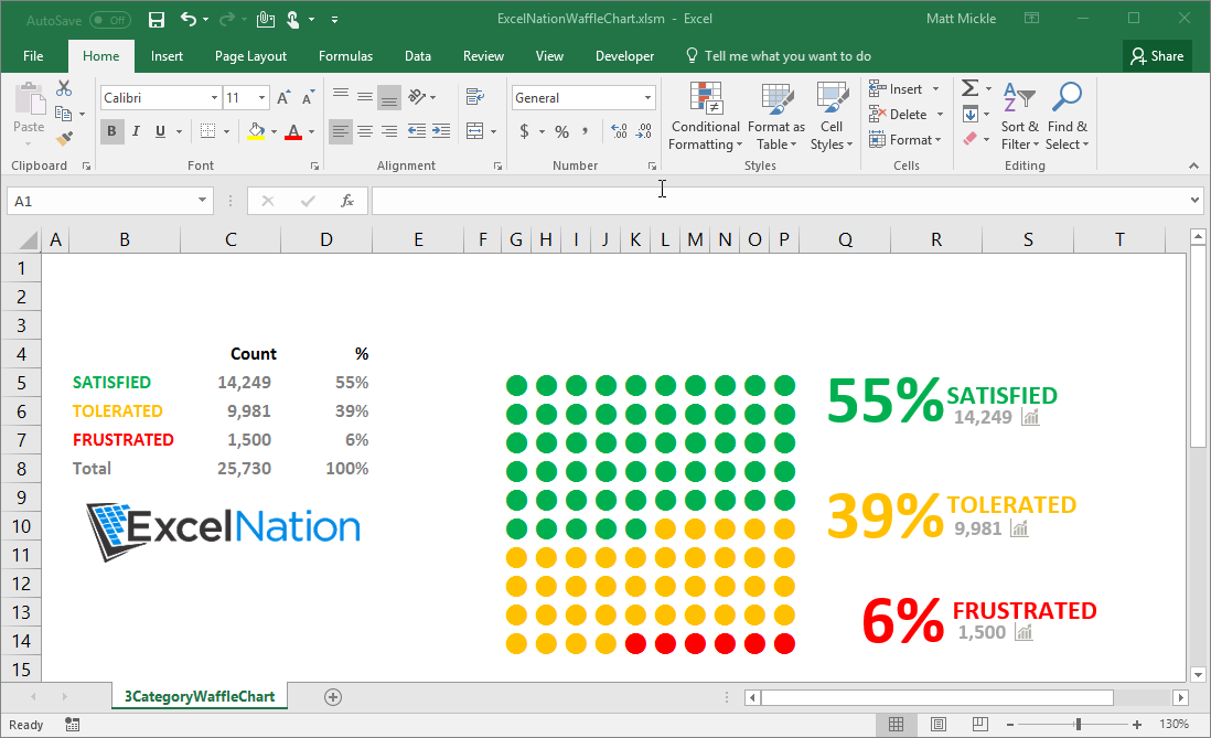
A waffle chart is a data visualization that displays data in a square 10 x 10 grid. Each square in the grid represents 1% of the total. This type of chart can be used as a substitute for a pie chart. Pie charts are great at displaying a part to whole relationship, but they can often be difficult for the viewer to interpret do to visual perception of angles and the difficulty with comparison. The waffle chart is far easier to interpret because it contains uniform squares that represent the same value. While waffle charts are typically composed of squares in this example we’ll use bullet points to create a more aesthetically pleasing visual. To accomplish this, you can review the example file and the commented worksheet event code. The code uses the data values to determine the appropriate number of bullets to color. When the values in the data table are updated the event code updates the waffle chart accordingly.
Example File(s)
Recent Posts
-
 Posted on Sep 28, 2022
Sequence Function
-
 Posted on Aug 25, 2021
Excel Nation is Alive!
-
 Posted on Aug 24, 2021
Outlook Email Automation
-
 Posted on Aug 24, 2021
Macros 101 - Task Automation
Related Posts

- VBA
- Macros
- Outlook